
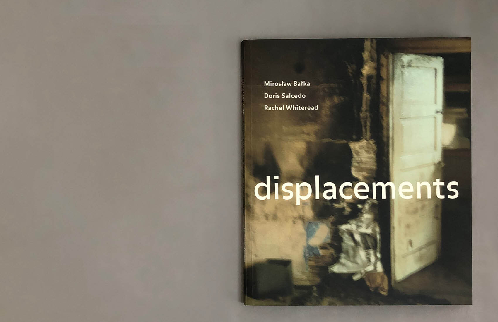


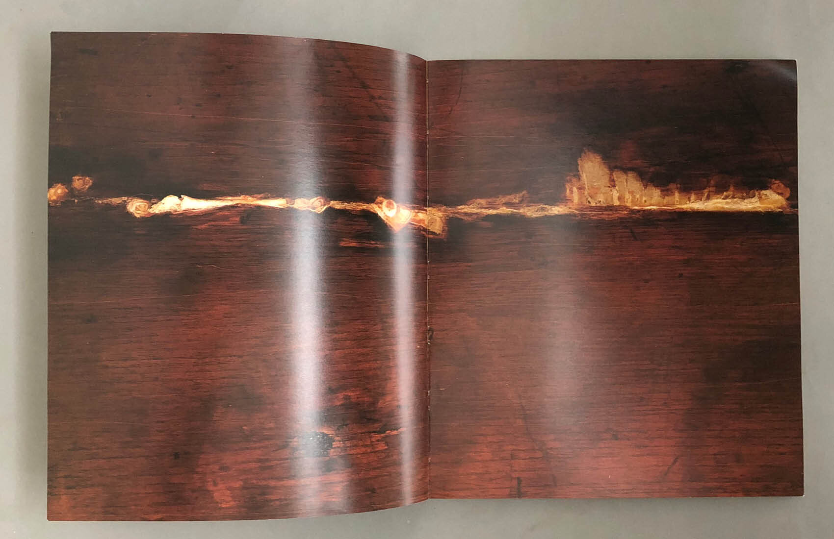


Displacements is an exhibition catalogue that I designed while working in house at the Art Gallery of Ontario in 1998. Because I was engaged in the process from the earliest planning stages I had the opportunity to art direct the photography of the some of the art works with an eye to how they would be presented in book form. The sans serif typeface used for everything in the book other than the main text and running heads is FFBalance designed by Evert Bloemsma which uses inverted stress (the emphasis on horizontal strokes rather than vertical) which makes it extremely legible in small point sizes. I used an uncoated paper stock for the middle text section of the book which begins on page 17 with a beautiful monochrome detail of a door from one of Doris Salcedo’s sculptures that I had photographed for this purpose. An image of a door is also featured on the cover of Displacements in a photo by Mirosław Bałka.
The evocative relationship between pages and doors can be found throughout the history of the book and has captured my imagination from early childhood.